React for Beginners: Learn the Fundamentals of React with a Simple Landing Page


Did you recently start learning React and are confused about how the pieces all come together to make something tangible?
Well, you are not alone, and I experienced this too while starting out. Learning React and using it for the first time can be challenging.
And this is because the setup is slightly different from what you are used to with HTML, CSS, and Javascript.
But in this article, you'd learn how React works and how all the pieces come together by building a mini landing page from scratch.
Prerequisite
While you don't need any working React knowledge to get the most out of this tutorial, here are a couple of things you should be comfortable with before moving forward:
Working knowledge of HTML & CSS. (You've at least built one project yourself)
You've heard about CSS frameworks. (We'd be using Tailwind CSS)
You understand how the following concepts work in JavaScript (Functions, Variables, arrays, conditionals, and basic DOM manipulation knowledge). If you don't, start here.
Basic knowledge about using your terminal.
You at least understand the basic concept of React. If you don't, start here.
You understand that JSX is just a tool that allows you to write HTML in React.
So what will you be building?
This is a challenge from Frontend Mentor, and it's meant to test your ability to create dropdown navigation menus. It's a typical pattern on many websites today.
You'd learn how to use React useState hook to deal with navigation toggles.
And if you don't understand what that means, don't worry. I'll give you a brief intro about it before you use it.
For now, let's focus on building out the UI. For styling, you'd learn how to use Tailwind CSS, a fantastic CSS framework that makes building responsive websites super easy.
Installations.
Now that we have things you should know out of the way, here are the things you'd need to set up and install on your local machine.
1. A Code Editor & React Extensions.
If you'd be using VS Code like me, make sure you have the following extensions installed to help with a faster development experience:
ES7+ React/Redux/React-Native snippets - This snippet will help you auto-complete React code.
Tailwind CSS IntelliSense - This snippet will help you auto-complete your tailwind classes.
Prettier - Code formatter - This extension allows your code to format neatly.
2. Install NodeJS
This tool will help you run and install React on your machine. Here's a link to download it if you still need to install it.
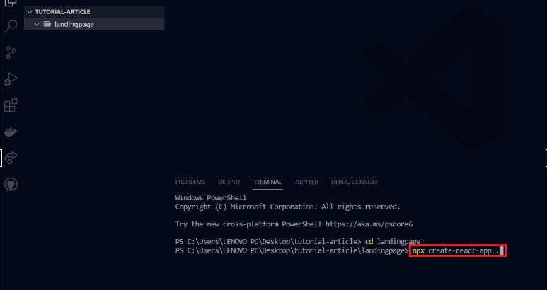
3. Install React
To do this, the easy way is to create a folder on your desktop and name anything. You can also create a subfolder like I did.
Now open that folder on your VS Code editor.
Navigate to your terminal on your VS Code, open a new terminal, run the following command, and hit the "Enter" key.
4. Install Tailwind CSS
Open another tab on your terminal and run the following command.
Make sure you run them one after the other.
First,
npm install -D tailwindcss postcss autoprefixer
then, npx tailwindcss init -p
When you are done with those, locate the "tailwind config file", open it and add the following code snippet to the “content” array.
"./src/**/*.{js,jsx,ts,tsx}"
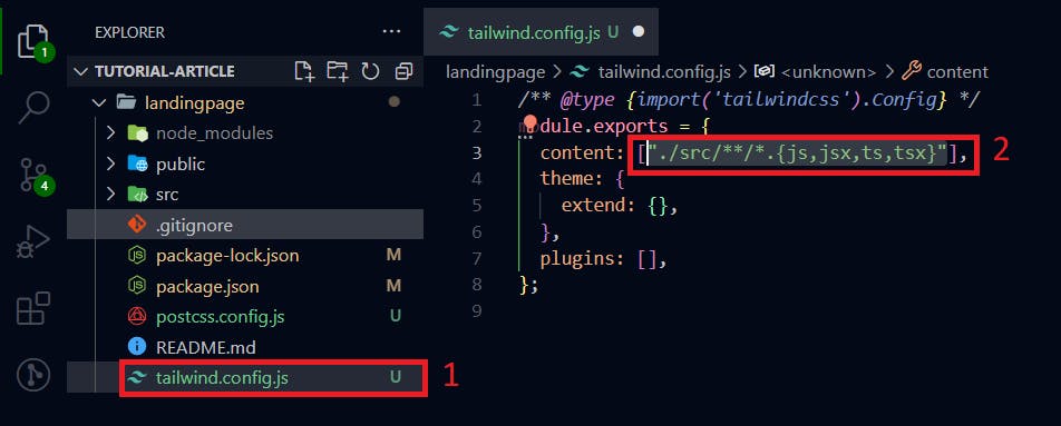
Go ahead and save this file and exit.
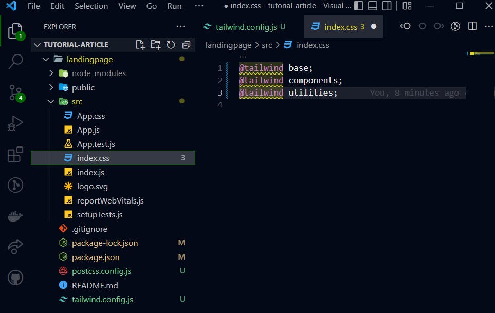
Finally, to complete the tailwind setup, copy the following code snippet and paste it into the "index.css" file, located in the "src" folder. Then, save the file and exit.
@tailwind base;
@tailwind components;
@tailwind utilities;
File and Folder Structure
Properly structuring your files in React is one thing you want to learn early. It'll help keep your code base easily manageable and readable.
And suppose the need to debug ever arises. In that case, it'll always be easy to locate individual files and take on them independently to spot the issue.
Steps to follow:
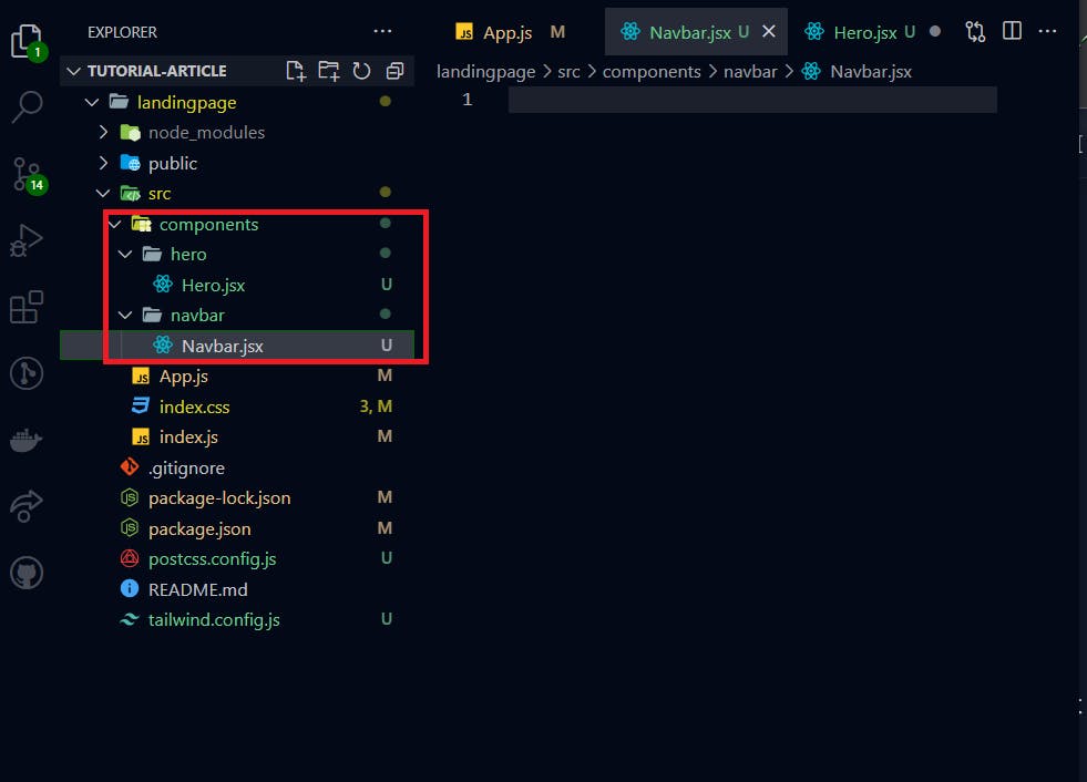
First, create a
componentsfolder in thesrcfolder.Then inside the
componentsfolder, create two other folders;navbarandhero.Inside each of these folders, create the respective file extensions that'll house each component's React code - In our case;
Navbar.jsxandHero.jsx.
Make sure you get the starter files here and import the images folder you see there into your own src folder. When you are done with all of this, head to your App.js file.
Open a new terminal and run the following command to spin up a development server.
npm start
This helps you preview your work on the browser.
Finally, make sure you import the fonts mentioned in the starter files into your index.jsx file.
Navbar Build

Looking at the navbar there are two partitions, and we'd be using the flex rule in CSS to separate them.
1. Starting from the Left Nav
Here's the code.
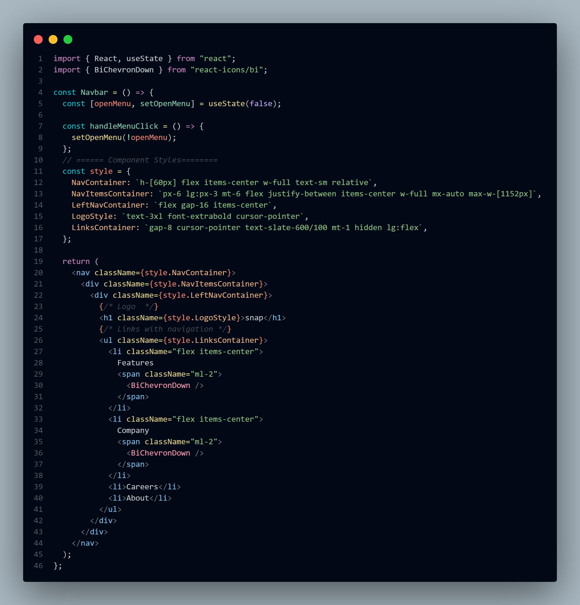
The styles are written a little differently from what you are probably used to.
This is because, while Tailwind CSS is a fantastic utility-first CSS framework, it can sometimes get cluttered and difficult to read.
So using CSS Modules would be a better strategy than adding classes directly to your returned JSX.
And with CSS Modules, you simply save your styles as Javascript objects, then you can immediately consume them as needed.
This approach improves your code's readability and debugging efficiency if any difficulty arises.
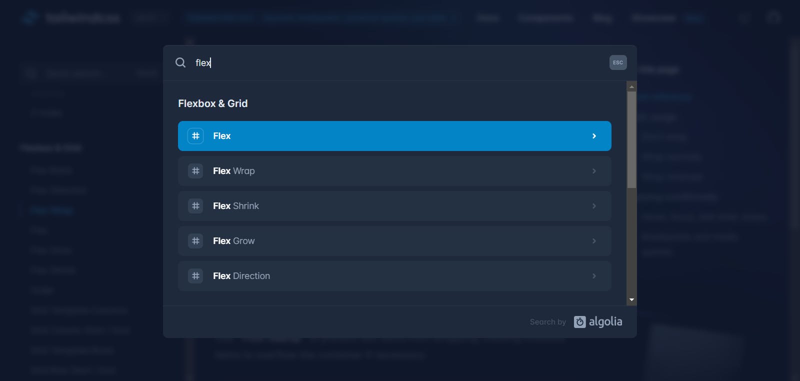
Also, if you need help understanding the CSS classes used here, head over to the official Tailwind CSS docs. Search for the individual classes used, and see what they do.
For example :
2. Right Nav
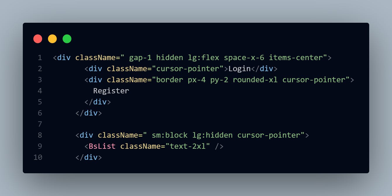
The code here is simple and easy to understand. The difference, however, is the menu icon that is added. The icon is meant to appear only on small and medium-sized screens and functions as a toggler for the mobile menu.
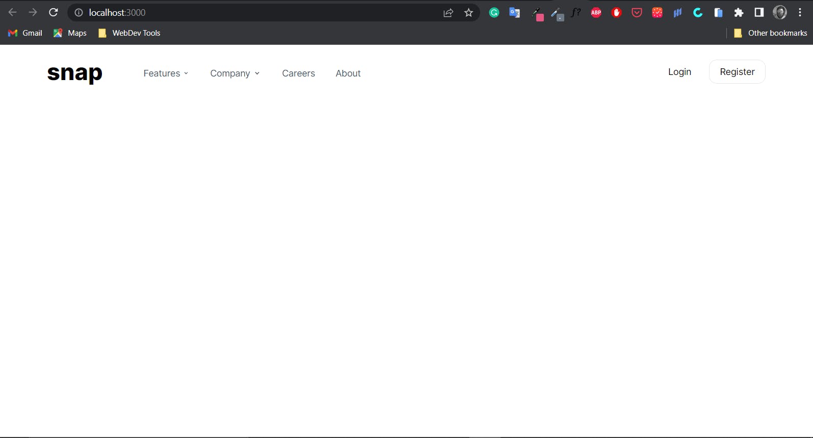
Result so far
If you've done everything correctly up until this point, this is what your work should look like:
Introduction to UseState Hook
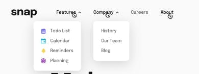
Here we'd make the desktop navigation active so that a short menu appears when a user clicks on the nav links. Just like in the image below:
But first, let's get the concept before we solve the problem.
What is a Hook in React?
It is a unique function that allows you to "tap into" exclusive React features. And one of these features is something called a "useState Hook."
One essential thing to understand here is that; React mainly works with the state of the application.
Here's what that means:
With React, you don't need to manually grab some HTML elements first, then change the values and update them on the webpage. Just like you would have done with vanilla javascript.
An ideal scenario would be when you want a specific link clicked, then something happens.
With Javascript you'd manually target the container housing the nav links.
Then target the specific link you want to add an event listener and use a javascript method to update that value to the webpage.
One benefit of React is that it takes away this manual cycle and handles them all under the hood for you.
Provided that you determine a system to manage the application's state.
And "State," in this context, simply refers to the data(i.e., the UI, Object, variables, etc.)used in that application at that point in time.
The key take-away behind why React created hooks is that once you change the value of the state of the application, the webpage automatically re-renders and updates the webpage with the new values.
And the useState Hook, is one of the clearest examples to exemplify this concept, and that's what we'd use to build the navigation toggles.
UseState Hook is a React hook that enables a function component to have state, or data that may alter and influence the component's behavior.
The convention is to name state variables like [something, setSomething] using array destructuring.
Desktop Navbar Links Toggle Build with UseState Hook.
Goal:
To show a sub-menu when the "features" and "company" menu links are clicked.
Steps:
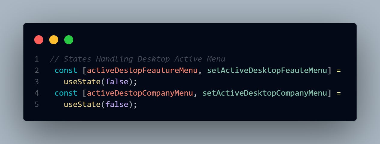
- First, declare the states:
Here, the states are set to false and would only change to true, showing the menu when clicked.
The "activeDesktopFeatureMenu" and "activeDesktopCompanyMenu" are the initial useState values used to show the submenus when they eventually get clicked.
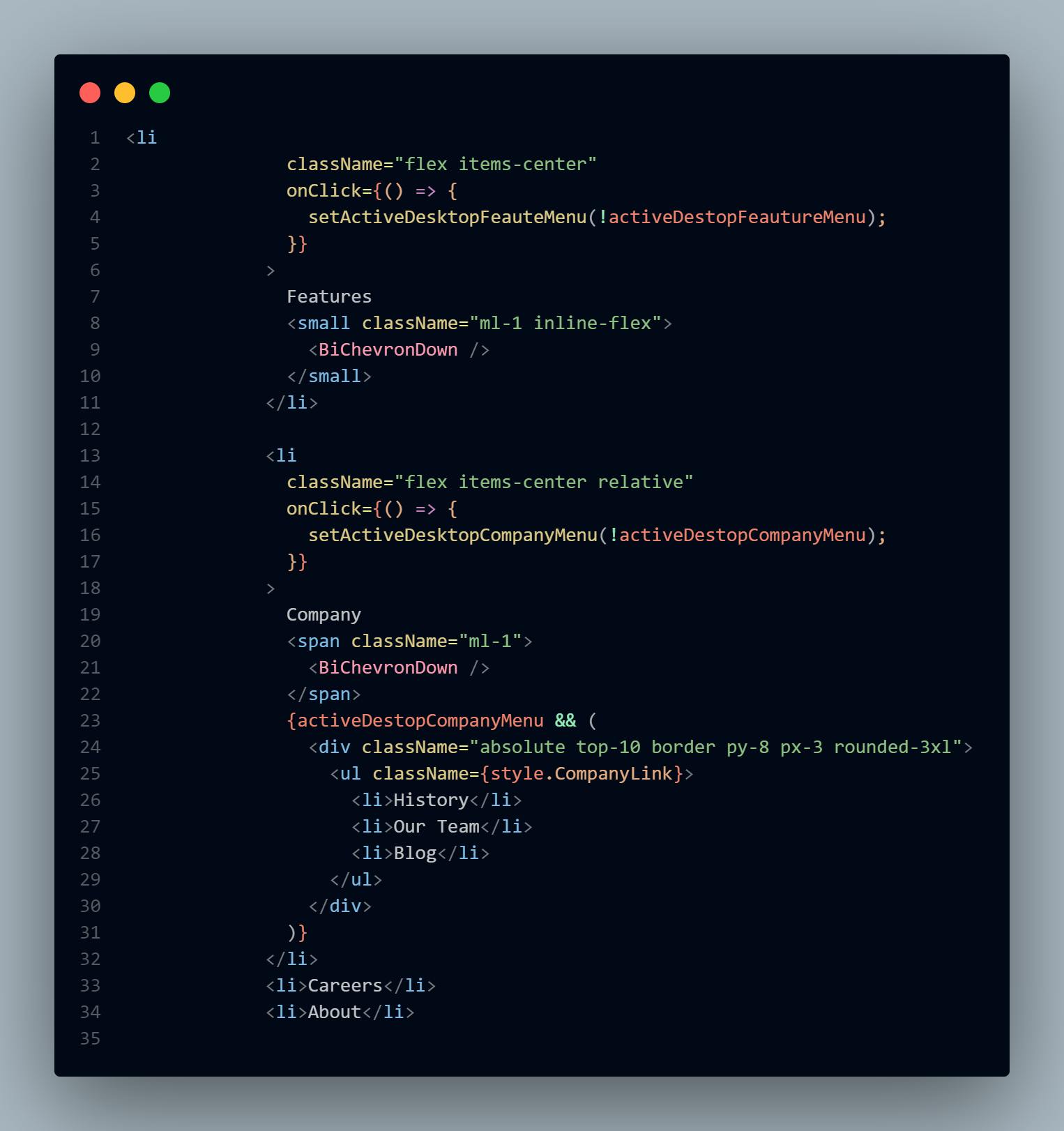
- Then, assign a click event to the "features" and "company" links.
Events like "onClick" in React act as built-in functions and can take in values as params, arguments, or even other functions.
So as seen in the picture below, the "onClick event/function" takes in an anonymous function, which in this case plays the role of the "useState setter function," as explained in the intro section of useState.
So here, the "setter function" is "setActiveDesktopFeauteMenu," and it updates the state after a user clicks.
It also accepts an argument, which represents the anticipated result or value of the event once it has happened.
In this case, the opposite of the "activeDestopFeatureMenu."
Sub-Menu UI Build
Before we build the UI of this component, let's discuss the concept to be used here first.
So the sub-menu is going to be a reusable component.
As you already know, React combines tiny UI components that compound to give fully blown websites or web apps.
These tiny components are often used across several website sections and might sometimes have different designs.
So when you come across problems like this, React has this concept of "children props" that takes care of reusing a component and assigning different values to it if necessary.
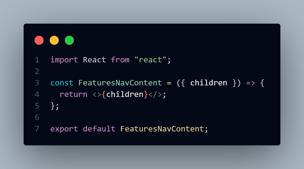
So children props displays whatever you include between the opening and closing tags when invoking a component as seen in the image below.
Here's how it works:
First, let's create the component. So go into the navbar folder, create a
FeaturesNavContent.jsxfilePass the "children props" and destructure it as seen below. The "children" prop comes by default in React.
Then go to the "links container/div", and create another div. Then put the newly created
FeaturesNavContentcomponent in the new div. Make sure it's an opening and closing tag like this :<FeaturesNavComponent><FeaturesNavComponent/>Then inside the above tag, pass in the following styles and your code should look something like this :
<FeaturesNavContent>
                    <ul className={style.ActiveLinkContainer}>
                      <li className={style.ActiveLink}>
                        <small className="mr-3 text-blue-700">
                          <RiTodoFill className="text-2xl" />
                        </small>
                        <small className="text-base">Todo List</small>
                      </li>
                      <li className={style.ActiveLink}>
                        <small className="mr-3">
                          <RiCalendarCheckFill className="text-2xl text-sky-400" />
                        </small>
                        <small className="text-base">Calender</small>
                      </li>
                      <li className={style.ActiveLink}>
                        <small className="mr-3">
                          <BsFillBellFill className="text-2xl text-yellow-400" />
                        </small>
                        <small className="text-base">Reminders</small>
                      </li>
                      <li className={style.ActiveLink}>
                        <small className="mr-3">
                          <IoTimer className="text-2xl text-purple-700" />
                        </small>
                        <small className="text-base">Planning</small>
                      </li>
                    </ul>
                  </FeaturesNavContent>
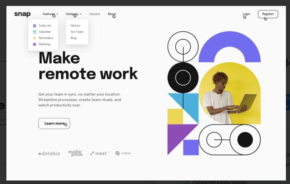
Above is the design for the "feature" sub-menu. For the "Company" sub-menu design, here's what the code looks like:
<div className="absolute top-10 border py-8 px-3 rounded-3xl">
                    <ul className={style.CompanyLink}>
                      <li>History</li>
                      <li>Our Team</li>
                      <li>Blog</li>
                    </ul>
                   </div>
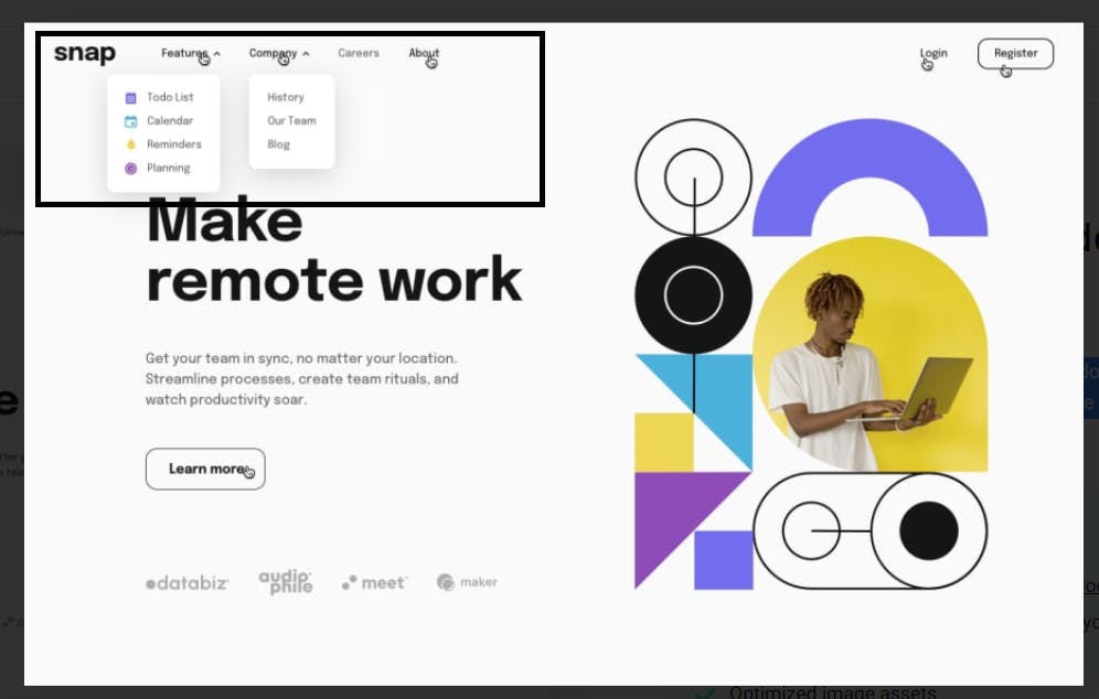
Now when you click on the respective links, you are meant to see something like this:
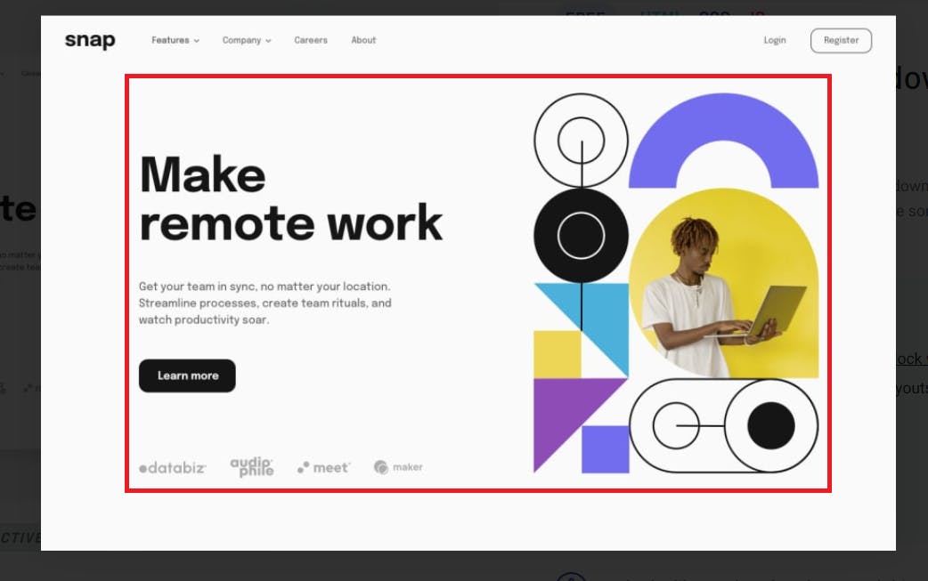
Creating the Hero Section
Here's what we'd be building next :
This section is straight forward and just needs you to understand CSS.
Here's the code snippet showing how you can get it done:
import React from "react";
import heroImg from "../../images/image-hero-desktop.png";
import sponsorOne from "../../images/client-audiophile.svg";
import sponsorTwo from "../../images/client-databiz.svg";
import sponsorThree from "../../images/client-maker.svg";
import sponsorFour from "../../images/client-meet.svg";
const Hero = () => {
  const style = {
    section: "absolute top-20 w-full -z-10 overflow-hidden",
    heroContainer:
      "justify-between my-7 md:my-16 items-center w-full mx-auto max-w-[1024px] h-full flex-col-reverse md:flex-row flex ",
    heroInfoContainer:
      "flex-1 w-full md:w-32 my-16 lg:my-0 mx-5 lg:mx-0 text-center md:text-start px-3",
    heroInfo: "pt-0 md:pt-32 lg:pt-36 mb-0  space-y-6 md:space-y-16",
    heroSponsors: "pt-3 justify-between flex flex-wrap items-center",
  };
  return (
    <section className={style.section}>
      <div className={style.heroContainer}>
        <div className={style.heroInfoContainer}>
          <div className={style.heroInfo}>
            <h3 className=" text-4xl md:text-6xl lg:text-6xl font-bold lg:w-[90%]">
              Make <br />
              remote work
            </h3>

            <div className="">
              <p className="my-6 md:my-8 text-sm md:text-base lg:w-[75%] leading-relaxed">
                Get your team in sync, no matter your location. Streamline
                processes, create team rituals, and watch productivity soar.
              </p>

              <button
                type="button"
                className=" py-3 px-6 capitalize rounded-xl bg-black text-white font-bold text-base"
              >
                learn More
              </button>
            </div>

            <div className={style.heroSponsors}>
              <img src={sponsorOne} alt="audiophile" />
              <img src={sponsorTwo} alt="databiz" className="mr-2" />
              <img src={sponsorThree} alt="maker" />
              <img src={sponsorFour} alt="meet" />
            </div>
          </div>
        </div>
        <div className="flex-1 w-full lg:pt-12 lg:w-64 mx-5">
          <img
            src={heroImg}
            alt="Hero"
            className="px-4 md:px-0 object-cover ml-0 md:ml-6 align-baseline"
            width={400}
          />
        </div>
      </div>
    </section>
  );
};

export default Hero;
In conclusion
React can seem overwhelming at first glance, and that's totally normal. Things get better with practice and when you understand the basics.
The good news is that this article covers most of the fundamental things you need to know to get started working with React.
Resources
GitHub repo: https://github.com/Izunnaya/React-beginner-landing-tut
Live Link: https://reactbeginnertut.netlify.app/
I'd love to connect with you via Twitter | LinkedIn | GitHub | .
See you in my next blog article. Take care!!!